Woofunnels - Optimize WooCommerce Checkout with Aero v3.23.2

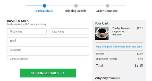
Checkout pages designed to convince and convert prospects. Create a multi-step checkout form with progress indicator to minimize friction. Use product & quantity selector to give the control to users. Persuade prospects with credible proof.
Has serious limitations
You can't add new or remove fields, change their order, or customize the page. The standard checkout looks the same for every business.
Leaves shoppers feeling anxious
User anxiety peaks on the checkout page. Sections on testimonials, support, and guarantees help pacify it. These are missing from default.
Ignores mobile shoppers
50.3% of traffic comes from mobile. But native checkout isn't optimized for the mobile experience.
The minimum length of a comment is 10 characters.
Related Posts

Sellkit Pro - Funnel Builder & Checkout Optimizer for WordPress & WooCommerce v2.0
Create high-converting WooCommerce sales funnels and optimize checkouts to sell faster than ever before.

FunnelKit Funnel Builder Pro v3.14.0
Conversion Optimized Checkout for WooCommerce FunnelKit delivers stunning, ready-to-use WooCommerce checkout templates, order forms, and one-page checkouts, optimized for higher conversions.

User Registration Pro v6.1.4
User Registration is the best WordPress registration form plugin. Creating a user registration form and a WordPress login form has never been easier.

ShopEngine Pro v2.7.2
A lightweight WooCommerce suite of Elementor solutions with lightning fast loading speed, packed with WooCommerce Builder, product comparisons, wishlists, variations, pre-order, fast checkout and

Extra Product Options & Add-Ons for WooCommerce v7.5.7.1
Does the current functionality of your WooCommerce Products meet your needs? Would you like to add Conditional Logic to your forms? Need further Pricing options to grab your shoppers attention?

Piotnet Addons Pro for Elementor v7.1.70
There are 3 widgets in the PAFE Form Builder: Field, Submit, and Multi Step Form, making it very easy to customise the layout and incorporate additional widgets into forms.